Data handling: Use variance and regression analysis to interpolate and extrapolate bivariate data
Unit 2: Represent data using a scatter plot
Gill Scott
Unit outcomes
By the end of this unit you will be able to:
- Draw a scatter plot.
- Understand when it is appropriate to use a scatter plot.
- Draw an intuitive line of best fit.
What you should know
Before you start this unit, make sure you can:
- Work with measures of central tendency and dispersion. To revise this refer to level 3 subject outcomes 4.1 and 4.2.
- Work with graphs of linear, quadratic and exponential functions. To revise this you can refer back to level 2 subject outcome 2.1, and level 3 subject outcome 2.1.
Introduction
Very often the purpose of an investigation is to find a relationship between two variables. For example height and mass; a taller person is likely to weigh more than a shorter person does. The aim is to find a mathematical expression of the relationship between these variables, because this would help to predict values for data elements that may not have been included in the set. In this unit, we will plot points to find the mathematical relationship between the variables of each element of data in a set.
Each element of univariate data has only one variable.
Each element of bivariate data has two variables.
Drawing scatter plots
When each element of data in a dataset consists of two parts, for example height and mass, it is called bivariate data, to indicate that it consists of two variables. A first step in analysing bivariate data is to visualise it by plotting the data elements on an [latex]\scriptsize x\text{-}y[/latex] coordinate system, with each axis representing one of the variables. The plotting of the data points is then analysed to see if the plotted points (the ‘scatter plot’) approximate the graph of one of the functions we have seen before.
Example 2.1
Example adapted from Siyavula Grade 11 Mathematics p. 480
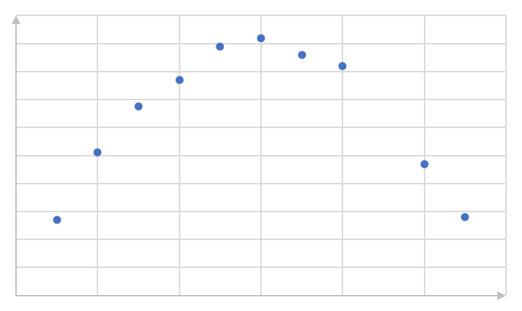
Eight children’s sweets consumption and sleeping habits were recorded as in the table below. Draw a scatter plot of the data by plotting the independent variables on the x-axis, and the dependent variables on the y-axis. Explain what you find.
| No. sweets per week | [latex]\scriptsize 15[/latex] | [latex]\scriptsize 9[/latex] | [latex]\scriptsize 10[/latex] | [latex]\scriptsize 6[/latex] | [latex]\scriptsize 23[/latex] | [latex]\scriptsize 8[/latex] | [latex]\scriptsize 13[/latex] | [latex]\scriptsize 3[/latex] |
| Average hours sleep per day | [latex]\scriptsize 4.5[/latex] | [latex]\scriptsize 5[/latex] | [latex]\scriptsize 6[/latex] | [latex]\scriptsize 7[/latex] | [latex]\scriptsize 3[/latex] | [latex]\scriptsize 3[/latex] | [latex]\scriptsize 4[/latex] | [latex]\scriptsize 8.5[/latex] |
Solution
The data can be plotted as follows:
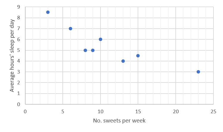
Looking at the scatter plot above, it appears that the points approximate a straight line, rather than any curve, although they clearly do not fit exactly to one straight line. It is also clear that the points in general have a negative relationship (the line has a negative gradient), with a lower consumption of sweets linked to higher average hours of sleep per day.
Take note!
When the function is a straight line, if increased values of the one variable correspond to increased values of the other variable, the relationship is said to be ‘positive’; this corresponds to the line having a positive slope. Similarly, if the line has a negative slope, and low values of one variable correspond to high values of the other variable, the relationship is said to be ‘negative’.
A straight line can be drawn approximating the points in the scatter plot in example 2.1, more or less as follows:
Once the line has been drawn, the normal processes can be used to find its equation.
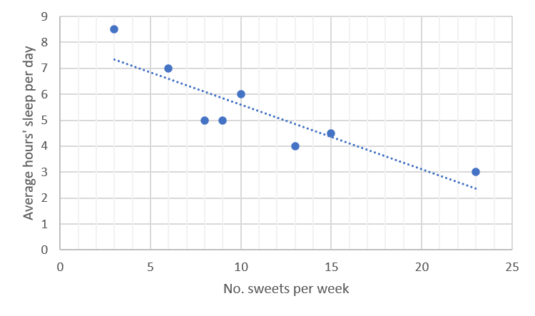
In the above graph:
- [latex]\scriptsize y\text{-intercept}=c=8[/latex]
- The straight line passes through the point [latex]\scriptsize (20,3)[/latex].
[latex]\scriptsize \begin{align*}y&=mx+c\\y&=mx+8\\3&=20m+8\\20m&=-5\\m&=-\displaystyle \frac{1}{4}\end{align*}[/latex]
So the equation of the line is [latex]\scriptsize y=-\displaystyle \frac{1}{4}x+8[/latex].
Take note!
In drawing the line:
- Take care that it follows the general direction followed by the points.
- If one or two points clearly do not follow the general direction, they are probably ‘outliers’, and should be ignored.
- Of those points that do not lie on the line, there should be more or less the same number above the line as below it.
- Clusters of points above and below the line should not occur at the ends of the line.
- Taking the above guidelines into account, the more points that lie on the line, the better.
Activity 2.1: Draw a scatter plot, and intuitively fit a curve
Activity adapted from an example in Siyavula, Grade 12 Mathematics Chapter 9 p 385
Time required: 15 minutes
What you need:
- a pen or pencil
- paper on which to draw a graph
What to do:
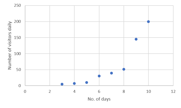
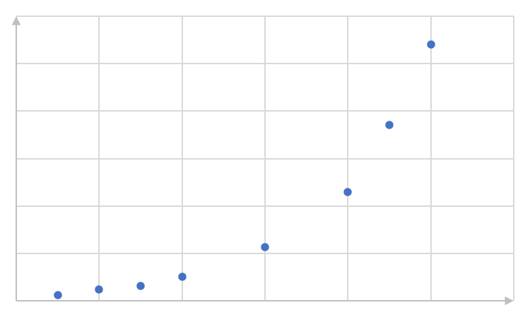
The following points represent numbers of visitors to a website ([latex]\scriptsize y[/latex]) on the [latex]\scriptsize x[/latex]th day since the establishment of the website.
[latex]\scriptsize (3,5);\text{ (4,7); (5,10); (6,30), (7,39); (8,51); (9,145); (10,200) }[/latex]
- Plot the points on an x-y coordinate system.
- Answer the following questions:
- What are the two variables being compared?
- What type of function best fits the data?
- Is the relationship between the two variables strong or weak?
- Is the relationship between the two variables positive or negative?
- Using the answers above, describe the relationship between the two variables in one sentence.
What did you find?
- Plot the points on an x-y coordinate system:
- .
- The variables being compared are the number of daily visitors and the number of days since establishment of the website.
- The data fit an exponential function.
- The data points do not fit the curve very closely, so the relationship can be described as weak.
- As time increases, the number of visitors increases, so the relationship can be described as positive.
- There is a weak, positive exponential relationship between the number of visitors to the website and the number of days since its establishment.
Note
For more explanations of drawing scatter plots and lines of best fit, have a look at the following sites when you have access to the internet:
Exercise 2.1
Question 1 adapted from Siyavula Grade 12 Mathematics Exercise 9-2
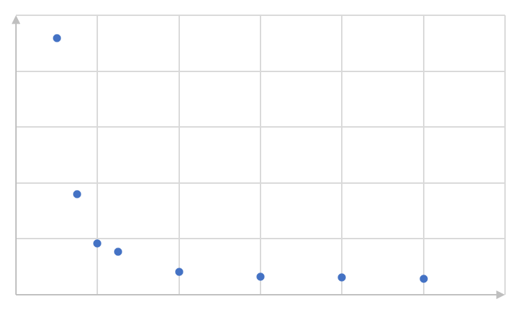
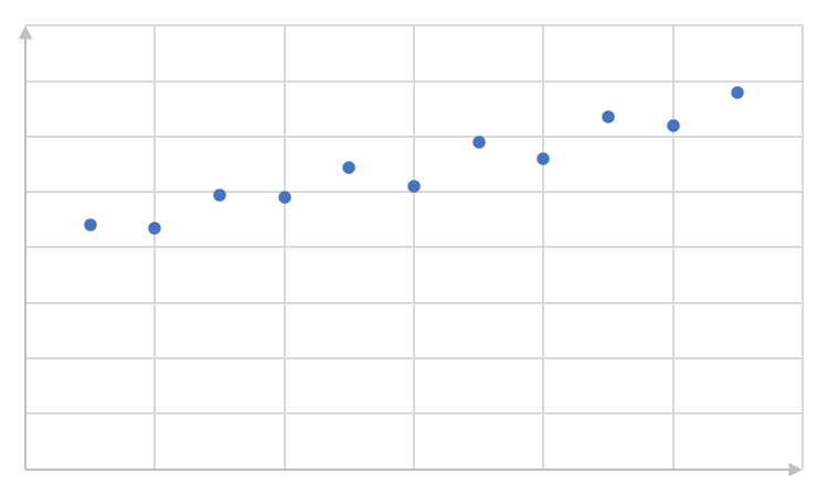
- Identify the function (linear, exponential or quadratic) which would best fit the data in each of the scatter plots below. Describe the relationship (positive or negative) where possible, and the strength of the fit:
- .
- .
- .
- .
- .
- .
Question 2 adapted from Siyavula Grade 12 Mathematics Exercise 9-2
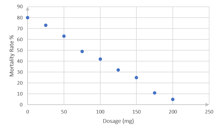
- Dr Dandara is a scientist trying to find a cure for a disease that has an [latex]\scriptsize 80\%[/latex] mortality rate. This means that [latex]\scriptsize 80\%[/latex] of people who get the disease will die. He knows of a plant which is used in traditional medicine to treat the disease. He extracts the active ingredient from the plant and tests different dosages (measured in milligrams) on different groups of patients. Examine the data below and complete the questions that follow.
Dosage (mg) [latex]\scriptsize 0[/latex] [latex]\scriptsize 25[/latex] [latex]\scriptsize 50[/latex] [latex]\scriptsize 75[/latex] [latex]\scriptsize 100[/latex] [latex]\scriptsize 125[/latex] [latex]\scriptsize 150[/latex] [latex]\scriptsize 175[/latex] [latex]\scriptsize 200[/latex] Mortality rate (%) [latex]\scriptsize 80[/latex] [latex]\scriptsize 73[/latex] [latex]\scriptsize 63[/latex] [latex]\scriptsize 49[/latex] [latex]\scriptsize 42[/latex] [latex]\scriptsize 32[/latex] [latex]\scriptsize 25[/latex] [latex]\scriptsize 11[/latex] [latex]\scriptsize 5[/latex] - Draw a scatter plot of the data.
- Which function would best fit the data? Draw in the line of best fit, and find its equation.
- Describe the fit in terms of strength and direction.
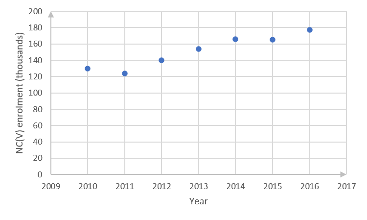
- The enrolment of learners for NC(V) programmes at TVET colleges was reported as follows:
Year [latex]\scriptsize 2010[/latex] [latex]\scriptsize 2011[/latex] [latex]\scriptsize 2012[/latex] [latex]\scriptsize 2013[/latex] [latex]\scriptsize 2014[/latex] [latex]\scriptsize 2015[/latex] [latex]\scriptsize 2016[/latex] NC(V) enrolment (in thousands) [latex]\scriptsize 130[/latex] [latex]\scriptsize 124[/latex] [latex]\scriptsize 140[/latex] [latex]\scriptsize 154[/latex] [latex]\scriptsize 166[/latex] [latex]\scriptsize 165[/latex] [latex]\scriptsize 177[/latex] - Draw a scatter plot with the year on the horizontal axis and the enrolment on the vertical axis.
- Draw a best fit line through the points and find its equation.
- What is the meaning of the gradient of the line?
- According to your model, what was the approximate enrolment in the year [latex]\scriptsize 0[/latex]. Do you think this answer is realistic? Discuss.
Question 4 adapted from Siyavula Grade 12 Mathematics Exercise 9-2
- Different climate conditions, such as temperature and rainfall, have significant effects on the yield of vegetable and other crops. Farmers need information of this type to work out the best time for planting. The following table matches average temperatures over a [latex]\scriptsize 12\text{-month}[/latex] period in different parts of a country against average crop yields recorded in tonnes per hectare.
Average monthly temperature [latex]\scriptsize 8[/latex] [latex]\scriptsize 10[/latex] [latex]\scriptsize 13[/latex] [latex]\scriptsize 15[/latex] [latex]\scriptsize 18[/latex] [latex]\scriptsize 20[/latex] [latex]\scriptsize 21[/latex] [latex]\scriptsize 19[/latex] Tonnes per hectare produced [latex]\scriptsize 10[/latex] [latex]\scriptsize 16[/latex] [latex]\scriptsize 22[/latex] [latex]\scriptsize 24[/latex] [latex]\scriptsize 23[/latex] [latex]\scriptsize 21[/latex] [latex]\scriptsize 18[/latex] [latex]\scriptsize 20[/latex] - Draw a scatter plot of the data.
- Which function would best fit the data? Draw in the line of best fit, and give the general form of its equation.
- Describe the fit in terms of strength.
The full solutions are at the end of the unit.
Summary
In this unit you have learnt the following:
- How to draw a scatter plot.
- When it is appropriate to draw a scatter plot.
- About drawing lines of best fit intuitively.
Unit 2: Assessment
Suggested time to complete: 40 minutes
Keep your solutions to these questions for referring to again in unit 3.
Question 1 adapted from NC(V) Mathematics Level 4 examination, November 2017
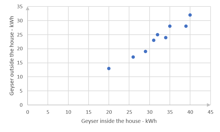
- A study was done to compare electricity usage of geysers that are inside or outside the house. The table below shows the electricity usage (in kilowatt hours) for equivalent water consumption for matched households that have geysers inside the house, and those with geysers outside the house. Nine houses of each type were considered in the study.
Inside the house (kWh) [latex]\scriptsize 29[/latex] [latex]\scriptsize 31[/latex] [latex]\scriptsize 20[/latex] [latex]\scriptsize 40[/latex] [latex]\scriptsize 26[/latex] [latex]\scriptsize 39[/latex] [latex]\scriptsize 32[/latex] [latex]\scriptsize 34[/latex] [latex]\scriptsize 35[/latex] Outside the house (kWh) [latex]\scriptsize 19[/latex] [latex]\scriptsize 23[/latex] [latex]\scriptsize 13[/latex] [latex]\scriptsize 32[/latex] [latex]\scriptsize 17[/latex] [latex]\scriptsize 28[/latex] [latex]\scriptsize 25[/latex] [latex]\scriptsize 24[/latex] [latex]\scriptsize 28[/latex] - Draw a scatter plot of the data.
- Draw a line of best fit.
- Find the equation of the line.
- Describe the relationship between the electricity usage when the geyser is inside the house and when it is outside.
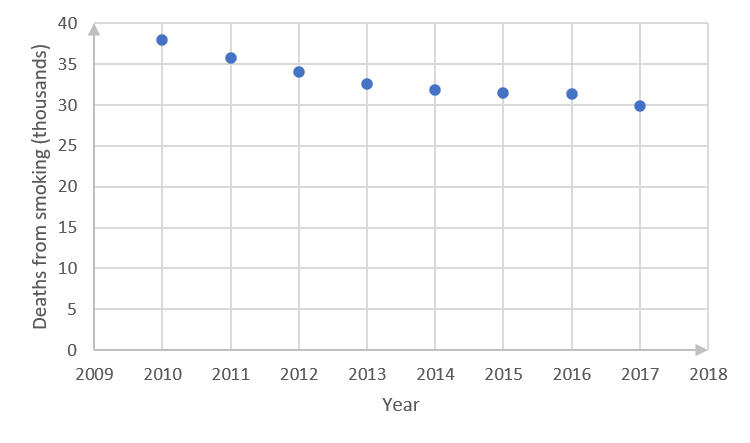
- Tobacco smoking is still one of the world’s largest health problems, although the prevalence of smoking is generally decreasing. The table below shows numbers of deaths (in thousands) in South Africa from smoking, in recent years.
Year [latex]\scriptsize 2010[/latex] [latex]\scriptsize 2011[/latex] [latex]\scriptsize 2012[/latex] [latex]\scriptsize 2013[/latex] [latex]\scriptsize 2014[/latex] [latex]\scriptsize 2015[/latex] [latex]\scriptsize 2016[/latex] [latex]\scriptsize 2017[/latex] Deaths [latex]\scriptsize ('000)[/latex] [latex]\scriptsize 38.0[/latex] [latex]\scriptsize 35.8[/latex] [latex]\scriptsize 34.1[/latex] [latex]\scriptsize 32.6[/latex] [latex]\scriptsize 31.8[/latex] [latex]\scriptsize 31.5[/latex] [latex]\scriptsize 31.3[/latex] [latex]\scriptsize 29.9[/latex] - Draw a scatter plot of the data.
- Draw the line of best fit.
- Find the equation of the line.
- Describe the relationship between the year and the number of deaths from smoking.
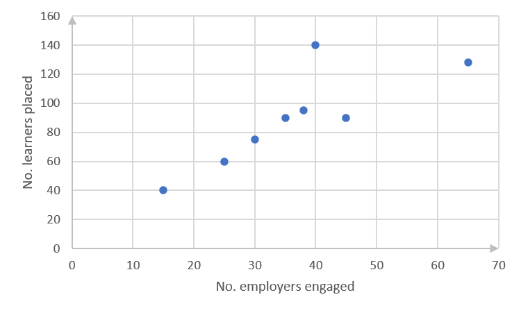
- A college helps learners to complete their national diplomas by negotiating with employers in the region with the aim of placing the learners for work experience. Over recent years they have tracked their engagements with employers against numbers of learners placed in work experience as follows:
No. employers engaged [latex]\scriptsize 15[/latex] [latex]\scriptsize 45[/latex] [latex]\scriptsize 65[/latex] [latex]\scriptsize 35[/latex] [latex]\scriptsize 38[/latex] [latex]\scriptsize 25[/latex] [latex]\scriptsize 40[/latex] [latex]\scriptsize 30[/latex] No. learners placed [latex]\scriptsize 40[/latex] [latex]\scriptsize 90[/latex] [latex]\scriptsize 128[/latex] [latex]\scriptsize 90[/latex] [latex]\scriptsize 95[/latex] [latex]\scriptsize 60[/latex] [latex]\scriptsize 140[/latex] [latex]\scriptsize 75[/latex] - Draw a scatter plot of the data.
- Draw the line of best fit.
- Find the equation of the line.
- Describe the relationship between the numbers of employers engaged and the numbers of learners placed.
Question 4 taken from NC(V) Mathematics Level 4 examination, November 2019
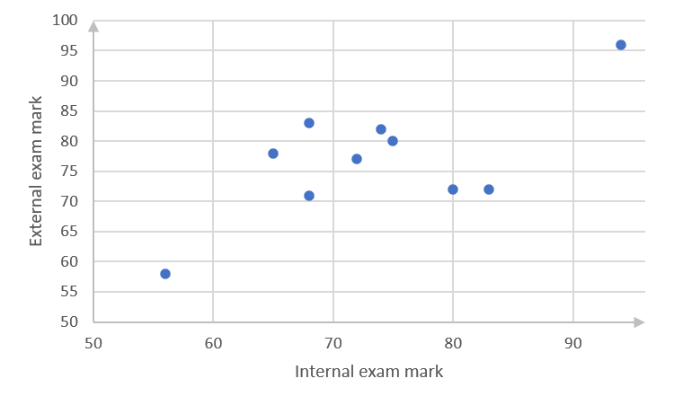
- The data below shows the mathematics marks of [latex]\scriptsize 10[/latex] learners at a college for the internal examinations and the external examinations.
Internal examinations [latex]\scriptsize (x)[/latex] [latex]\scriptsize 80[/latex] [latex]\scriptsize 68[/latex] [latex]\scriptsize 94[/latex] [latex]\scriptsize 72[/latex] [latex]\scriptsize 74[/latex] [latex]\scriptsize 83[/latex] [latex]\scriptsize 56[/latex] [latex]\scriptsize 68[/latex] [latex]\scriptsize 65[/latex] [latex]\scriptsize 75[/latex] External examinations [latex]\scriptsize (x)[/latex] [latex]\scriptsize 72[/latex] [latex]\scriptsize 71[/latex] [latex]\scriptsize 96[/latex] [latex]\scriptsize 77[/latex] [latex]\scriptsize 82[/latex] [latex]\scriptsize 72[/latex] [latex]\scriptsize 58[/latex] [latex]\scriptsize 83[/latex] [latex]\scriptsize 78[/latex] [latex]\scriptsize 80[/latex] - Draw a scatter plot of the marks in the above table on an x-y plane, with each axis showing values from [latex]\scriptsize 50[/latex] to [latex]\scriptsize 96[/latex].
- Draw the line of best fit.
- Find the equation of the line.
- Describe the relationship between the internal and external examination marks.
The full solutions are at the end of the unit.
Unit 2: Solutions
Exercise 2.1
- .
- Weak, negative linear relationship
- Fairly strong quadratic relationship
- Strong positive, exponential relationship
- Negative exponential relationship
- Weak positive linear relationship
- .
- .
The data points approximate a straight line. - .
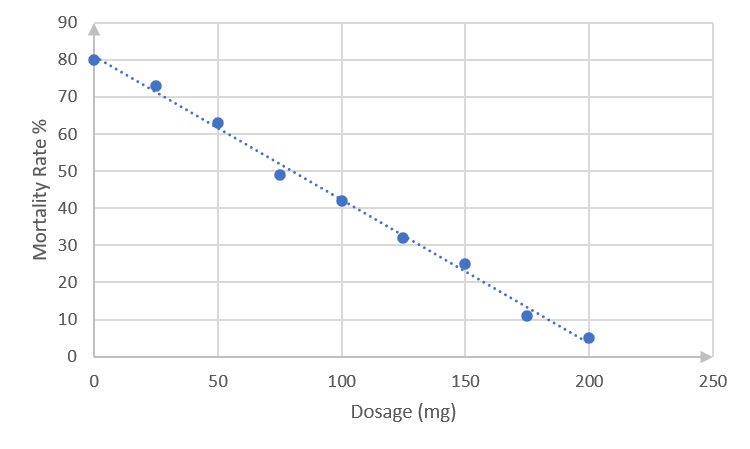
The best-fit line passes through points [latex]\scriptsize (0,80)[/latex]and [latex]\scriptsize (200,5)[/latex]. (You might have drawn a slightly different straight line, in which case your equation would be a bit different from that calculated below. Check that your line complies with the guidelines in the notes before activity 2.1.)
Using the method you learnt in level 3 subject outcome 3.2 unit 1, or any other method, the equation of this straight line can be found as follows.
[latex]\scriptsize \begin{align*}\displaystyle \frac{{y-{{y}_{1}}}}{{x-{{x}_{1}}}}&=\displaystyle \frac{{{{y}_{2}}-{{y}_{1}}}}{{{{x}_{2}}-{{x}_{1}}}}\\\displaystyle \frac{{y-80}}{{x-0}}&=\displaystyle \frac{{5-80}}{{200-0}}\\y-80&=-\displaystyle \frac{{3x}}{8}\\y&=-\displaystyle \frac{{3x}}{8}-80\end{align*}[/latex] - There is a strong negative relationship between an increase in the dosage and a decrease in the mortality rate.
- .
- .
- .
- .
(You might have drawn a slightly different straight line, in which case your equation would be different from that calculated below. Check that your line complies with the guidelines in the notes before activity 2.1.)
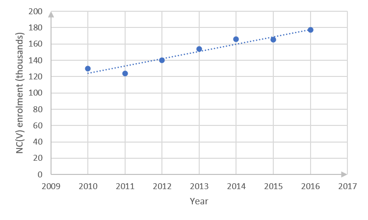
Best-fit line passes through point [latex]\scriptsize (2014,160)[/latex]and [latex]\scriptsize (2016,180)[/latex].
[latex]\scriptsize \begin{align*}\displaystyle \frac{{y-{{y}_{1}}}}{{x-{{x}_{1}}}}&=\displaystyle \frac{{{{y}_{2}}-{{y}_{1}}}}{{{{x}_{2}}-{{x}_{1}}}}\\\displaystyle \frac{{y-160}}{{x-2\text{ }014}}&=\displaystyle \frac{{180-160}}{{2\text{ }016-2\text{ }014}}\\y-160&=\displaystyle \frac{{20}}{2}\left( {x-2\text{ }014} \right)\\y&=10x-20\text{ }140+160\\y&=10x-19\text{ 980}\end{align*}[/latex] - With the gradient of the line being [latex]\scriptsize 10[/latex], this means that the enrolment is increasing every year by a factor of [latex]\scriptsize 10[/latex].
- The straight-line graph indicates a negative enrolment of [latex]\scriptsize -19\text{ 980}[/latex] in year [latex]\scriptsize 0[/latex]. This is not realistic, since it would need the college to have been enrolling NC(V) learners for more than [latex]\scriptsize 2\text{ 000}[/latex] years, while the curriculum was only introduced in [latex]\scriptsize 2007[/latex].
- .
- .
Average monthly temperature [latex]\scriptsize 8[/latex] [latex]\scriptsize 10[/latex] [latex]\scriptsize 13[/latex] [latex]\scriptsize 15[/latex] [latex]\scriptsize 18[/latex] [latex]\scriptsize 20[/latex] [latex]\scriptsize 21[/latex] [latex]\scriptsize 19[/latex] Tonnes per hectare produced [latex]\scriptsize 10[/latex] [latex]\scriptsize 16[/latex] [latex]\scriptsize 22[/latex] [latex]\scriptsize 24[/latex] [latex]\scriptsize 23[/latex] [latex]\scriptsize 21[/latex] [latex]\scriptsize 18[/latex] [latex]\scriptsize 20[/latex] - .
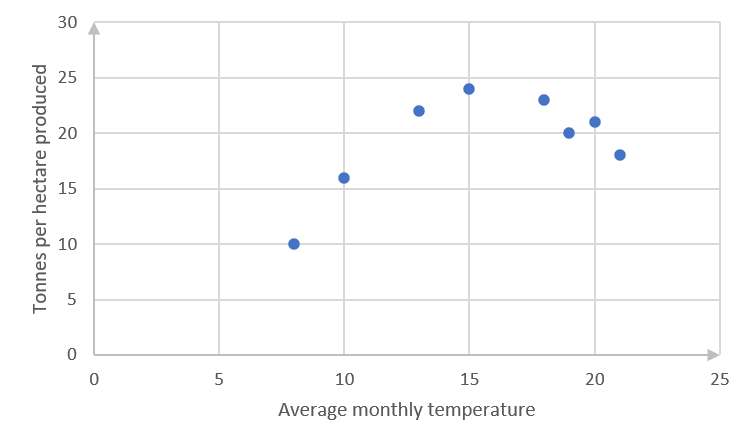
- The scatter plot seems to indicate a quadratic equation.
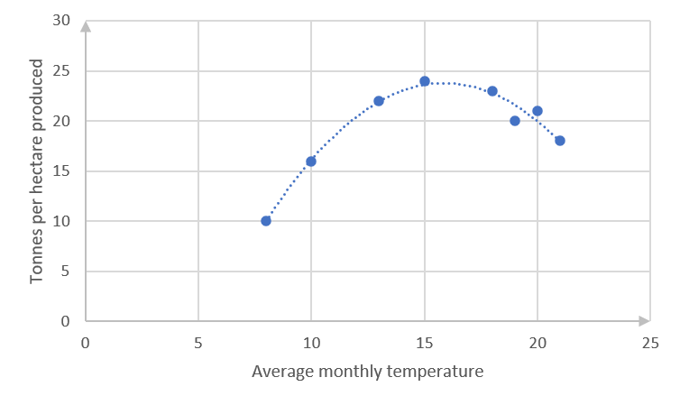
[latex]\scriptsize y=-a{{x}^{2}}+bx-c[/latex]
The coefficients of [latex]\scriptsize {{x}^{2}}[/latex] and the constant are indicated as negative because the curve is concave facing down, and the y-intercept will clearly be negative if the curve is continued to that point. - There is a strong fit between the data and the curve.
- .
Note: You are not required to find equations of best fit lines for scatter plots that do not satisfy or approximate straight lines, but you should be able to recognise the type of graph that best fits the data.
Unit 2: Assessment
- .
Inside the house (kWh) [latex]\scriptsize 29[/latex] [latex]\scriptsize 31[/latex] [latex]\scriptsize 20[/latex] [latex]\scriptsize 40[/latex] [latex]\scriptsize 26[/latex] [latex]\scriptsize 39[/latex] [latex]\scriptsize 32[/latex] [latex]\scriptsize 34[/latex] [latex]\scriptsize 35[/latex] Outside the house (kWh) [latex]\scriptsize 19[/latex] [latex]\scriptsize 23[/latex] [latex]\scriptsize 13[/latex] [latex]\scriptsize 32[/latex] [latex]\scriptsize 17[/latex] [latex]\scriptsize 28[/latex] [latex]\scriptsize 25[/latex] [latex]\scriptsize 24[/latex] [latex]\scriptsize 28[/latex] - .
- .
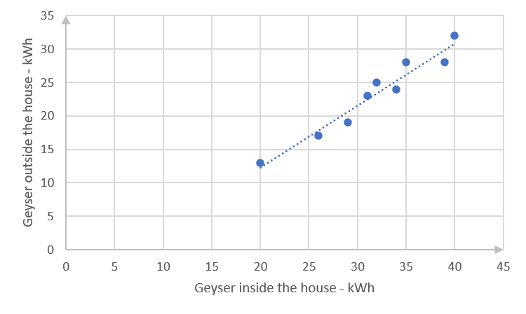
(You might have drawn a slightly different straight line, in which case your equation would be different from that calculated in c. below. Check that your line complies with the guidelines in the notes before activity 2.1.) - The straight line passes through [latex]\scriptsize (20,13)[/latex] and [latex]\scriptsize (35,26)[/latex].
[latex]\scriptsize \begin{align*}\displaystyle \frac{{y-{{y}_{1}}}}{{x-{{x}_{1}}}}&=\displaystyle \frac{{{{y}_{2}}-{{y}_{1}}}}{{{{x}_{2}}-{{x}_{1}}}}\\\displaystyle \frac{{y-13}}{{x-20}}&=\displaystyle \frac{{26-13}}{{35-20}}\\y-13&=\displaystyle \frac{{13}}{{15}}(x-20)\\y&=\displaystyle \frac{{13x}}{{15}}-\displaystyle \frac{{52}}{3}+\displaystyle \frac{{39}}{3}\\y&=\displaystyle \frac{{13x}}{{15}}-\displaystyle \frac{{13}}{3}\end{align*}[/latex] - There is a strong, positive relationship between electricity usage when the geyser is inside the house and when it is outside.
- .
- .
Year [latex]\scriptsize 2010[/latex] [latex]\scriptsize 2011[/latex] [latex]\scriptsize 2012[/latex] [latex]\scriptsize 2013[/latex] [latex]\scriptsize 2014[/latex] [latex]\scriptsize 2015[/latex] [latex]\scriptsize 2016[/latex] [latex]\scriptsize 2017[/latex] Deaths [latex]\scriptsize ('000)[/latex] [latex]\scriptsize 38.0[/latex] [latex]\scriptsize 35.8[/latex] [latex]\scriptsize 34.1[/latex] [latex]\scriptsize 32.6[/latex] [latex]\scriptsize 31.8[/latex] [latex]\scriptsize 31.5[/latex] [latex]\scriptsize 31.3[/latex] [latex]\scriptsize 29.9[/latex] - .
- .
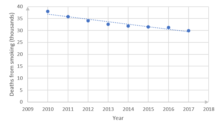
- The straight line passes more or less through the points [latex]\scriptsize (2016,31)[/latex] and [latex]\scriptsize (2012,34)[/latex].
(You might have drawn a slightly different straight line, in which case your equation would be a bit different from that calculated below. Check that your line complies with the guidelines in the notes before activity 2.1.)
The equation of the line is the following:
[latex]\scriptsize \begin{align*}\displaystyle \frac{{y-{{y}_{1}}}}{{x-{{x}_{1}}}}&=\displaystyle \frac{{{{y}_{2}}-{{y}_{1}}}}{{{{x}_{2}}-{{x}_{1}}}}\\\displaystyle \frac{{y-31}}{{x-2016}}&=\displaystyle \frac{{34-31}}{{2012-2016}}\\y-31&=-\displaystyle \frac{3}{4}(x-2016)\\y&=-\displaystyle \frac{{3x}}{4}+1512+31\\y&=-\displaystyle \frac{{3x}}{4}+1543\end{align*}[/latex] - The relationship between the year and the numbers of deaths from smoking is a strong negative one.
- .
- .
No. employers engaged [latex]\scriptsize 15[/latex] [latex]\scriptsize 45[/latex] [latex]\scriptsize 65[/latex] [latex]\scriptsize 35[/latex] [latex]\scriptsize 38[/latex] [latex]\scriptsize 25[/latex] [latex]\scriptsize 40[/latex] [latex]\scriptsize 30[/latex] No. learners placed [latex]\scriptsize 40[/latex] [latex]\scriptsize 90[/latex] [latex]\scriptsize 128[/latex] [latex]\scriptsize 90[/latex] [latex]\scriptsize 95[/latex] [latex]\scriptsize 60[/latex] [latex]\scriptsize 140[/latex] [latex]\scriptsize 75[/latex] - .
- .
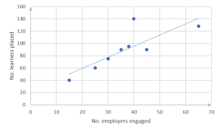
- The straight line passes more or less through [latex]\scriptsize (20,60)[/latex] and [latex]\scriptsize (60,132)[/latex]. (You might have drawn a slightly different straight line, in which case your equation would be a bit different from that calculated below. Check that your line complies with the guidelines in the notes before Activity 2.1.)
The equation of the line is the following:
[latex]\scriptsize \begin{align*}\displaystyle \frac{{y-{{y}_{1}}}}{{x-{{x}_{1}}}}&=\displaystyle \frac{{{{y}_{2}}-{{y}_{1}}}}{{{{x}_{2}}-{{x}_{1}}}}\\\displaystyle \frac{{y-60}}{{x-20}}&=\displaystyle \frac{{132-60}}{{60-20}}\\y-60&=\displaystyle \frac{{72}}{{40}}(x-20)\\y&=1.8x-24\end{align*}[/latex] - There is a positive relationship between numbers of employers engaged and numbers of learners placed, but this is not a very strong relationship.
- .
- .
- .
- .
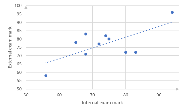
- The straight line passes through points [latex]\scriptsize (70,75)[/latex] and [latex]\scriptsize (90,87)[/latex]. (You might have drawn a slightly different straight line, in which case your equation would be a bit different from that calculated below. Check that your line complies with the guidelines in the notes before activity 2.1.)
The equation of the line is the following:
[latex]\scriptsize \begin{align*}\displaystyle \frac{{y-{{y}_{1}}}}{{x-{{x}_{1}}}}&=\displaystyle \frac{{{{y}_{2}}-{{y}_{1}}}}{{{{x}_{2}}-{{x}_{1}}}}\\\displaystyle \frac{{y-75}}{{x-70}}&=\displaystyle \frac{{87-75}}{{90-70}}\\y-75&=\displaystyle \frac{{12}}{{20}}(x-70)\\y&=\displaystyle \frac{{3x}}{5}-33\end{align*}[/latex] - There is a weak, positive relationship between internal and external examinations.
- .
Media Attributions
- MathsL4 SO4.2 Unit2 Image 1 © DHET is licensed under a CC BY (Attribution) license
- MathsL4 SO4.2 UNit2 Image 2 © DHET is licensed under a CC BY (Attribution) license
- MathsL4 SO4.2 Unit2 Image 3 © DHET is licensed under a CC BY (Attribution) license
- MathsL4 SO4.2 Unit2 Image 4 (Exercise 2.1 no1a) © DHET is licensed under a CC BY (Attribution) license
- MathsL4 So4.2 Unit2 Image 5 © DHET is licensed under a CC BY (Attribution) license
- MathsL4 SO4.2 UNit2 Image 6 © DHET is licensed under a CC BY (Attribution) license
- MathsL4 SO4.2 UNit2 Image 7 © DHET is licensed under a CC BY (Attribution) license
- MathsL4 SO4.2 UNit2 Image 8 © DHET is licensed under a CC BY (Attribution) license
- MathsL4 SO4.2 UNit2 Image 9 © DHET is licensed under a CC BY (Attribution) license
- MathsL4 SO4.2 UNit2 Image 10 © DHET is licensed under a CC BY-SA (Attribution ShareAlike) license
- MathsL4 SO4.2 UNit2 Image 11 © DHET is licensed under a CC BY (Attribution) license
- MathsL4 SO4.2 UNit2 Image 12 © DHET is licensed under a CC BY (Attribution) license
- MathsL4 SO4.2 UNit2 Image 13 © DHET is licensed under a CC BY (Attribution) license
- MathsL4 SO4.2 UNit2 Image 14 © DHET is licensed under a CC BY (Attribution) license
- MathsL4 SO4.2 UNit2 Image 15 © DHET is licensed under a CC BY (Attribution) license
- MathsL4 SO4.2 UNit2 Image 16 © DHET is licensed under a CC BY (Attribution) license
- MathsL4 SO4.2 UNit2 Image 17 © DHET is licensed under a CC BY (Attribution) license
- MathsL4 SO4.2 UNit2 Image 18 © DHET is licensed under a CC BY (Attribution) license
- MathsL4 SO4.2 UNit2 Image 19 © DHET is licensed under a CC BY (Attribution) license
- MathsL4 SO4.2 UNit2 Image 20 © DHET is licensed under a CC BY (Attribution) license
- MathsL4 SO4.2 UNit2 Image 21 © DHET is licensed under a CC BY (Attribution) license
- MathsL4 SO4.2 UNit2 Image 22 © DHET is licensed under a CC BY (Attribution) license

.png?role=personal)